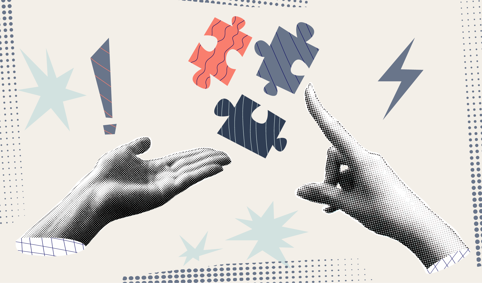
The Real ROI of Brand Design
Most people think branding is about how something looks. That is the surface level. In reality, brand is how people perceive your value before you ever speak to them.
When it is done well, it affects how much you can charge, how easily you attract the right clients, and how smoothly your business runs. The return is not always obvious at first, but it shows up everywhere once the system is in place.
Pricing power is where the real money is
The biggest return from brand design comes from your ability to charge more without resistance. A strong brand signals that your business is established, intentional, and trustworthy. That lowers the perceived risk for a potential client. (Talking about you, Apple.)
Imagine two businesses offering the same service. One looks inconsistent and unclear. The other feels polished, focused, and confident. The second business does not just win more work. It wins better work at higher rates.
That difference in perception directly impacts your pricing power. You stop competing on cost and start competing on value.
Strong branding reduces friction in the sales process
When your brand is clear, it answers key questions before a client even reaches out. People quickly understand what you do, who it is for, and whether you are a good fit.
Without that clarity, people hesitate. They second guess. They leave.
With it, you get shorter sales cycles, fewer back and forth conversations, and more decisive clients. You spend less time convincing and more time closing.
Consistency creates long term leverage
Most businesses are not struggling because of bad design. They are struggling because nothing is consistent.
Their website feels different from their social content. Their marketing materials do not align. Every new asset requires starting from scratch.
A well built brand system removes that problem. It gives you a clear set of rules for how everything should look and feel. That leads to faster execution, stronger recognition, and less mental effort every time you create something new.
Over time, that consistency compounds. People begin to recognize your business instantly, which builds trust before you even enter the conversation.
First impressions shape everything that follows
People form an opinion about your business within seconds. That initial reaction determines whether they stay, explore, or leave.
Your brand is either building trust or creating doubt. There is no neutral middle ground.
A strong identity communicates that you take your work seriously. It feels intentional and established. That alone can be the difference between someone reaching out or moving on to the next option.
Better branding attracts better clients
Brand design is not just about attracting more people. It is about attracting the right people.
When your positioning and visuals are clear, you naturally draw in clients who value what you do. At the same time, you filter out those who are only looking for the cheapest option.
This leads to better projects, fewer difficult situations, and less scope creep. You spend more time doing meaningful work and less time managing misaligned expectations.
It is a long term asset, not a short term expense
Brand design is not something you use once and forget. It becomes part of the foundation of your business.
A strong identity can last for years and support everything you create going forward. It strengthens every marketing effort and every client interaction.
Unlike advertising, which stops working when you stop paying, a solid brand continues to deliver value over time. It grows with your business instead of needing to be replaced constantly.
What the return actually looks like
The return on brand design rarely shows up as a simple one to one financial gain. It shows up in how your business operates and grows.
You may find that you can charge significantly more for the same type of work. You may notice that clients make decisions faster and with more confidence. You may spend less time fixing inconsistencies and more time focusing on growth.
These shifts are what create real, lasting return.
The part most people overlook
Branding only works if you use it properly. A logo sitting in a folder has no value. Guidelines that are ignored do not create consistency.
The return comes from applying the brand across everything you do and sticking to it over time. That is where the compounding effect happens.
Final thought
If you think about branding as a cost, it will always feel expensive. If you see it as a tool that increases perceived value, reduces friction, and improves consistency, it becomes one of the highest leverage investments you can make in your business.
Before investing, ask yourself if you are trying to grow or just improve how things look. Make sure you are ready to actually use the system you are paying for.
When those pieces are in place, brand design stops being an expense and starts acting like a multiplier.

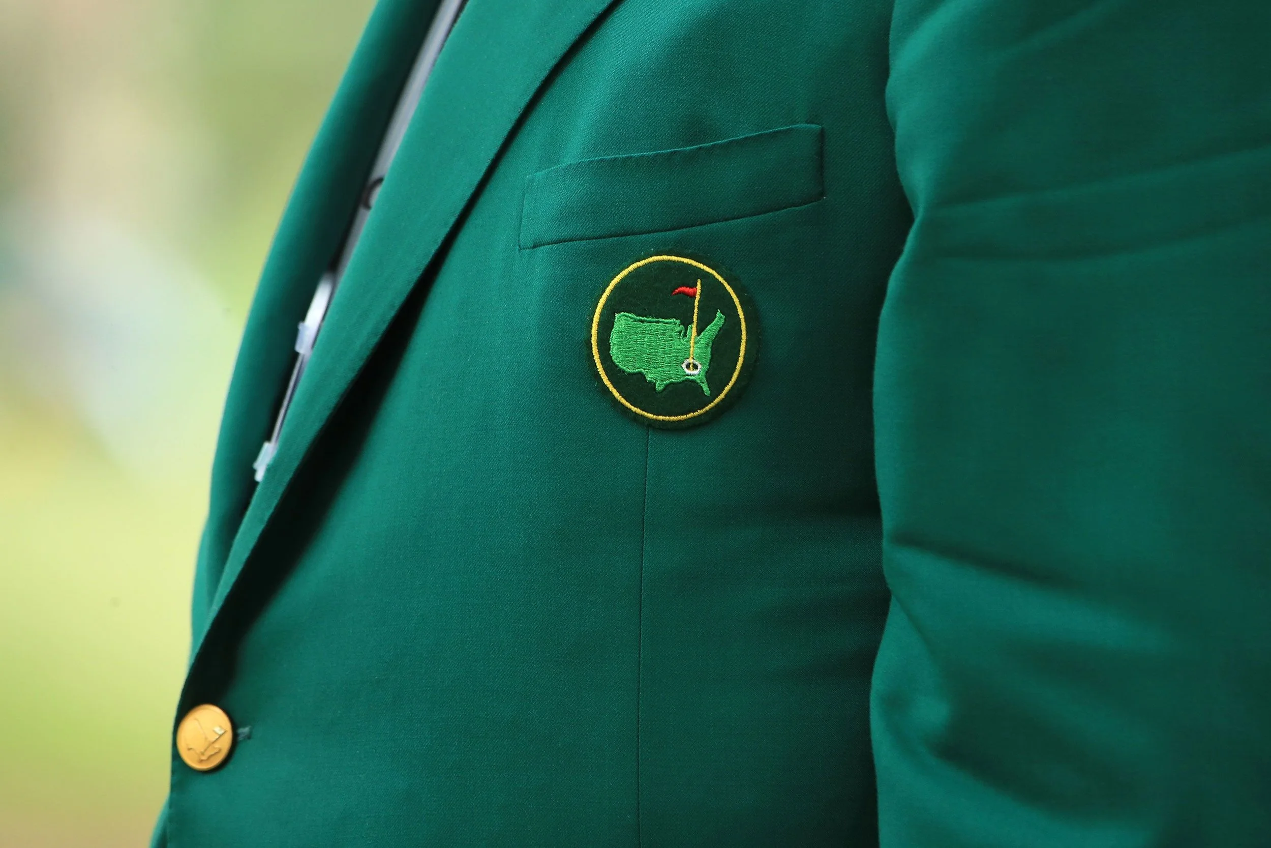
Gold jacket, green jacket... who gives a shit?
Most brands (and people) are just plain scared to stand out
Over the years I have seen it happen countless times. A team starts with a bold vision but slowly gets spooked by the idea of being "too much." They start sanding down the edges until the brand is perfectly smooth, perfectly safe, and perfectly invisible. They trade impact for comfort and then wonder why nobody remembers their name.
The world does not need another tasteful navy blazer
Take that specific shade of rye grass green at the Masters. In a vacuum it is a disaster. It is stubborn and loud. By every standard of modern fashion that jacket is an eyesore. You might even be tempted to shrug it off like Happy Gilmore:
"Gold jacket, green jacket. Who gives a shit?"
But the truth is everyone gives a shit. Even if you think you do not care your brain is doing the work for you. That jacket makes a difference because it creates a permanent mental landmark. It works because it refuses to be ignored, and is now the most coveted jacket in sports history.
I spent a long time hiding in a JCREW blue checkered shirt
In high school I loved anything punk rock. It was Blink 182, Green Day, and New Found Glory. It was where I began to learn to put my personality on full display. I had painted nails, homemade tshirts, blue hair, and a guitar hanging on my shoulder.
But after college I was told to clean up. I was told to be more professional and not to “be weird”. Over the years I became a button down blue and white checkered shirt with chinos and a "fun" white sneaker shell of my original self.
I looked around at my industry and realized I no longer stood out. No one asked me about my hair. No compliments. No nothing. To quote Happy again:
“If I saw myself in clothes like that, I’d have to kick my own ass.”
“Nice” is just another word for forgettable
I had a bold decision to make. I dusted off my buzzers and cut a mohawk. I broke out the hair dye and got a fresh coat of Mooncat 404: Soul Not Found (the absolute best). I cranked up MxPx and started having fun again.

Suddenly I felt way more at ease talking with people. Conversations ignited with no effort. My toddler lights up when I change my colors. "Daddy pink! Daddy green!"
I am finally back to my old self and it is coming through in my work.
Calling All Skeletons
I see companies chase a cold tech startup tone because it feels safe. They want to be nice because nice does not get criticized. But if you are not willing to be a little polarizing you are choosing to be ignored.
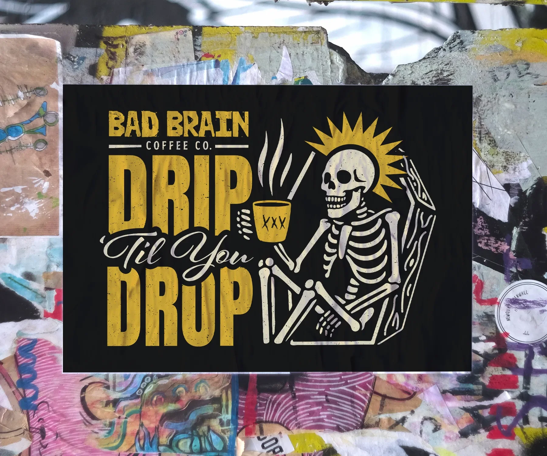
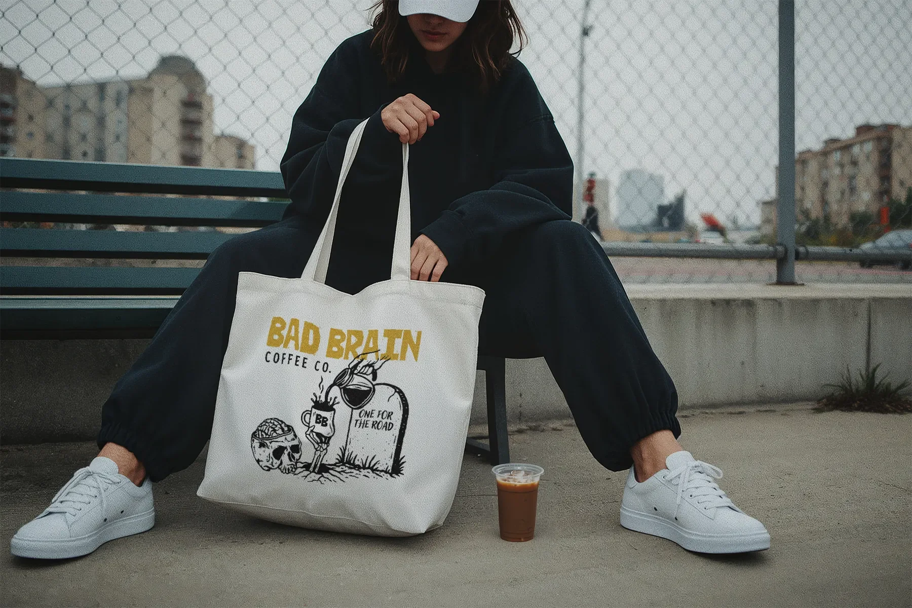
I recently felt this same spark with the owner of Bad Brain Coffee. We had an instant connection over their mantra "fueled by punk rock." This mantra was the guiding force behind the new merch designs we made, featuring designs like "Drip til you drop," "Unholy grounds," and "One for the road".

Don't be scared be bold
The Green Jacket is not trying to be pretty. It is trying to be iconic. People will remember you if you give them a reason to look. Now, go have some fun!

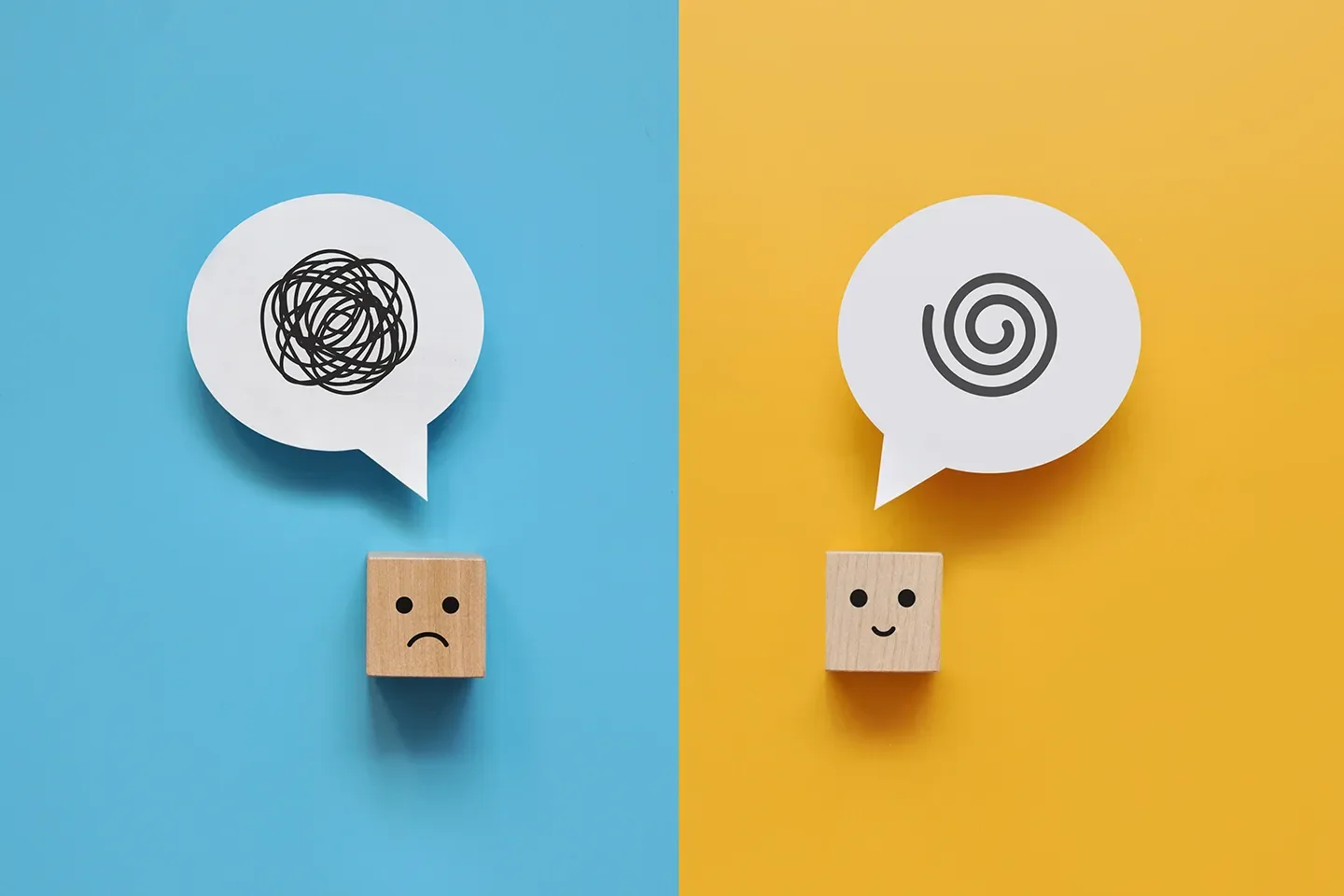
Clarity or Chaos? What My Toddler Taught Me About Brand Clarity
My daughter gives me 5 seconds before the chaos starts. Turns out, so does your audience. Here's what working alongside a toddler taught me about clarity, constraints, and what it actually takes to earn attention.
My daughter gives me about 5 seconds.
That's the window between when she notices I'm on a call and when the chaos begins. Blocks get thrown. Snacks get demanded. The dog gets chased. Whatever I was trying to explain to a client? Gone.
Working from home with a toddler will humble you fast. But it's also taught me something I now apply to every brand I work on:
If your message requires more than 5 seconds to land, it's not a clarity problem. It's a strategy problem.
Toddlers don't have patience. Neither does your audience.
Here's what I've noticed: the moments I get flustered on a call — where I'm stumbling to explain what I do or why a design decision matters — those are always the moments where the thinking wasn't finished yet.
A toddler just makes that obvious faster.
Your audience is doing the same thing. They're distracted, half-reading, skimming for a reason to care. If your headline needs a subtitle to make sense, or your sales deck requires slide 4 to justify slide 2, you haven't solved a communication problem. You've created one.
Clarity isn't a copywriting trick. It's evidence that the strategy is working.
But here's the thing — she can also lock in completely.
Same kid who can't sit through a sentence will watch the same four minutes of Trash Truck on repeat for 45 minutes straight (secretly, I do too.) She'll stack the same blocks in the same order, over and over, with the focus of someone defusing a bomb. She'll hand me a book and sit completely still while I read it — twice — without moving.
So it's not that her attention span is short. It's that most things don't earn it.
I started paying attention to what actually locked her in. And the pattern is pretty consistent:
It moves. Static things get ignored. Things with motion, sound, or change get watched.
It's familiar enough to feel safe, but surprising enough to feel interesting. She knows Bluey. She knows what's coming. But something small is always different — a new problem, a new game — and that gap is what keeps her watching.
It makes her feel something. Not informed. Not educated. Something. She laughs, she points, she grabs my arm. Emotional response first, comprehension second.
Your audience works exactly the same way.
The brands that earn sustained attention aren't the ones with the most information. They're the ones that feel familiar enough to trust and surprising enough to stay with. They move — visually, narratively, emotionally. They make you feel something before they explain anything.
A sales deck that opens with a stat nobody asked for loses the room by slide 3. A deck that opens with a problem the reader recognizes? They lean in. That's the Bluey effect. Start with something they already feel, then bring them somewhere new.
Short attention spans aren't the problem. Unearned attention is.
Constraints are a gift.
I used to carve out long, uninterrupted blocks for deep creative work. That's not my life anymore.
Now I get 20-minute windows. A nap. A snack distraction. The length of one episode of Bluey.
And honestly? The work got sharper.
When you know you only have 20 minutes, you don't spend 10 of them staring at a blank document. You make a decision and move. You stop over-engineering. You ask yourself the only question that actually matters: What is this trying to say?
Constraints force prioritization. And prioritization is the foundation of every good design decision I've ever made.
The brands that struggle with consistency usually don't have a design problem. They have a prioritization problem. Too many messages. Too many voices. Too much trying to say everything at once.
The real test of clear communication.
There's a version of the "explain it to a five-year-old" rule that I now live by: explain it before she gets into my office.
I apply the same pressure to brand messaging. If I can't articulate a brand's value in a single clear sentence — before someone clicks away, before the slide changes, before the attention is gone — then we're not done yet.
Not "we offer integrated solutions across the enterprise value chain."
Not "a platform-agnostic, full-funnel approach to modern brand activation."
Something a real person can hear, understand, and repeat to someone else.
That's the bar. And it's a high one.
What this actually changes in how I work.
A few things have shifted for me since I started working around a tiny, unpredictable human:
I prototype faster. I don't wait for perfect. I make something, test the idea against the problem, and refine. Toddlers have no use for "almost ready." Neither do deadlines.
I cut more ruthlessly. Every word on a deck, every element in a layout has to earn its place. If something isn't pulling weight, it's a distraction. My daughter has no patience for distractions. Your audience doesn't either.
I ask the real question first. Before I open any design software, I ask: what does this need to communicate, and to whom? Not "what should it look like." That part comes after. Always.
Design is problem-solving with style.
I've been saying this for years. But raising a toddler while running a design practice has given it new teeth.
The best design decisions I've made weren't the most elaborate. They were the most clear. A headline that stops the scroll. A slide layout that guides the eye without fighting it. A brand system so intuitive that the marketing team doesn't need to ask questions.
Clarity isn't a nice-to-have. It's the job.
My daughter taught me that. One interrupted call at a time.ee

The “5 Whys” — A Simple Framework That Builds Stronger Brands
Discover how the 5 Whys helps a graphic designer for brands uncover root issues and build stronger brand consistency design systems.
Most design requests start with a surface-level problem.
“We need a new logo.”
“Our sales deck design isn’t working.”
“This ebook feels outdated.”
Maybe that’s true. But before opening Illustrator, there’s a better move:
Ask why.
Then ask it again.
Five times.
The 5 Whys is a classic root-cause framework originally used in manufacturing and operations. The idea is simple: keep asking “why?” until you uncover the real issue.
In branding, this changes everything. Because most companies don’t need new visuals. They need clarity. And clarity is what a graphic designer for brands is really hired to create.
Why the 5 Whys Works in Branding
Design problems are rarely just design problems — they’re alignment problems. When a marketing team says they need a new presentation, a seasoned corporate design expert doesn’t jump straight to fonts, colors, or layouts. Instead, they dig deeper to understand what isn’t working and why. Is the messaging unclear? Is the positioning weak? Is the brand system inconsistent? Asking those questions shifts the work from surface-level decoration to strategic thinking. That’s how you move beyond isolated assets and begin building true brand consistency design — the kind that supports long-term clarity instead of short-term fixes.
Example 1: “We Need a New Sales Deck”
Let’s walk through a real-world scenario.
Problem:
“Our sales deck design isn’t converting.”
Why?
Because prospects lose interest halfway through.
Why?
Because the slides feel generic.
Why?
Because they look like every competitor’s deck.
Why?
Because we don’t have a defined visual system.
Why?
Because our brand evolved, but we never built scalable guidelines.
Now we’re somewhere useful.
This isn’t a PowerPoint problem. It’s a brand system problem.
Instead of redesigning 20 slides, the solution becomes building a consistent visual framework that supports positioning across sales, marketing, and production design for marketing teams.
That’s strategic design.
Example 2: “Our White Papers Feel Flat”
Another common one:
Problem:
“Our ebook and white paper design feels boring.”
Why?
Because people aren’t reading it.
Why?
Because it’s text-heavy.
Why?
Because we just poured the copy into a template.
Why?
Because we didn’t plan the information hierarchy visually.
Why?
Because we treated design as formatting instead of strategy.
Now the issue isn’t aesthetics — it’s communication structure.
A strategic infographic designer mindset transforms dense research into scannable insight. Layout becomes part of storytelling. Data becomes digestible. Authority increases.
The fix isn’t “more color.” It’s better visual logic.
Example 3: “We Want a Rebrand”
This one sounds big — and it often is.
Problem:
“We need a rebrand.”
Why?
Because our brand feels outdated.
Why?
Because it doesn’t reflect who we are now.
Why?
Because our services evolved.
Why?
Because we expanded into new markets.
Why?
Because our positioning changed — but our visuals didn’t.
Now this isn’t about a logo refresh. It’s about strategic alignment.
This is where a strong creative director portfolio reflects more than aesthetics. It shows the ability to connect business evolution with visual systems — across event and environmental graphics, sales decks, campaign assets, and beyond.
Without asking the 5 Whys, you redesign a logo.
With it, you redesign the brand foundation.
The Real Value of Asking Why
The 5 Whys forces pause.
It slows down reaction. It sharpens focus. It reveals patterns.
For marketing teams juggling campaigns, production design for marketing teams often becomes reactive. Deadlines drive decisions. Visual drift happens. Consistency erodes.
But when you uncover root causes, you build systems instead of patches.
And systems scale.
That’s the difference between hiring someone to “make it look better” and partnering with a graphic designer for brands who thinks structurally.
Design Is Problem-Solving With Style
Design isn’t about making things flashy — it’s about making them aligned. Aligned with positioning, aligned with audience, and aligned with business goals. That’s where the 5 Whys becomes powerful. It’s a simple framework, but it forces clarity before creativity. The most effective design work doesn’t begin with software or style choices; it begins with the right question — the one that uncovers what the brand truly needs to communicate and why it matters.
Ready to Solve the Right Problem?
If your brand feels reactive — or your marketing materials don’t quite connect — it may not be a design execution issue. It may be a clarity issue.
Want to build brand consistency design that scales across sales, campaigns, and environments?
What a Graphic Designer for Brands Actually Does
What does a graphic designer for brands actually do? Learn how brand consistency design turns strategy into scalable marketing systems that build trust.
If you think a graphic designer for brands just picks fonts and adjusts logos, we need to talk.
Design isn’t decoration. It’s decision-making. It’s alignment. It’s translating strategy into something people can see, understand, and trust. And when it’s done well, it doesn’t just make a brand look better—it makes marketing work better.
So what does a graphic designer for brands actually do?
They Build Systems, Not Just Assets
Anyone can design a single great-looking piece. A landing page. A brochure. A slide. But brands don’t live in one-off pieces. They live in ecosystems.
They show up in sales deck design, campaign visuals, ebook and white paper design, social templates, internal presentations, and event and environmental graphics. Without a cohesive system behind them, those pieces start to drift. The typography shifts slightly. The color palette expands unofficially. Layout rules get ignored under deadline pressure.
A true graphic designer for brands builds visual systems—type hierarchies, grid structures, spacing logic, reusable templates—so everything feels connected. That’s brand consistency design in action. It’s not restrictive; it’s empowering. It gives teams clarity so they can move faster without breaking the brand.
They Protect Brand Consistency (Especially When Things Get Busy)
Marketing teams don’t operate in calm, controlled environments. They operate in real time.
Campaign launches. Product updates. Trade shows. Quarterly pushes. New messaging directions. Tight timelines.
In that kind of environment, brand consistency design becomes essential. Small inconsistencies compound quickly. A slightly off-color here. A different headline treatment there. A deck that “almost” feels on brand. Individually, these are minor. Collectively, they weaken perception.
Consistency builds familiarity. Familiarity builds trust. And trust builds revenue.
A seasoned corporate design expert understands that brand integrity isn’t about rigid rules—it’s about protecting clarity across every touchpoint, whether it’s a high-stakes sales deck design or large-scale event and environmental graphics.
They Translate Strategy Into Visual Language
Brand strategy often lives in documents. Positioning statements. Audience personas. Messaging frameworks.
But customers don’t experience strategy in a PDF. They experience it visually.
A graphic designer for brands interprets what “premium but approachable” actually looks like. They determine how visual hierarchy can support a complex value proposition. They design layouts that respect the attention span of a busy executive reading an ebook and white paper design. They structure information the way an experienced infographic designer would—so data becomes insight instead of noise.
This is where design stops being subjective and starts being strategic.
They Think Beyond the Logo
Logos matter. But they are only the entry point.
Real brand leadership shows up in the systems that surround the logo: presentation frameworks, scalable marketing templates, production-ready campaign assets, and guidelines that actually get used. Strong production design for marketing teams ensures that as content scales, the brand scales with it.
This is often the difference between hiring a designer to execute tasks and working with someone whose creative director portfolio reflects strategic oversight. The latter sees the big picture. They understand how one asset connects to the entire brand narrative.
They Make Marketing More Efficient
One of the most overlooked benefits of working with a graphic designer for brands is operational efficiency.
When typography is defined, templates are thoughtfully built, spacing rules are consistent, and asset libraries are organized, everything moves faster. Campaigns launch more smoothly. Revisions decrease. New team members onboard more quickly. Marketing doesn’t reinvent the wheel with every new initiative.
Strong design systems reduce friction. And reducing friction is a business advantage.
Design Is Problem-Solving With Style
At its core, design is problem-solving with style. It’s not about making something trendy or flashy. It’s about making it clear.
Clear positioning. Clear hierarchy. Clear communication.
When clarity meets consistency, brands feel confident. And confident brands convert.
The Bottom Line
A graphic designer for brands isn’t there to “make it pretty.” They build scalable systems, protect brand consistency, translate strategy into visual language, and support marketing teams as they grow.
Pretty is easy.
Purposeful is powerful.
Ready for a More Cohesive Brand?
If your materials feel disconnected—or your marketing team is scaling faster than your brand system can handle—it may be time to bring in strategic design leadership.
Want to bring clarity and consistency to your brand content? Let’s talk.

Ground Control to Major Tom: Vinyl is Still Titan of Industry (And What It Taught Me About Design)
Before I was a graphic designer for brands, I was a kid digging through my dad’s record collection. Vinyl wasn’t just music—it was an experience. That crackle, that cover art, that sense of intention? It stuck with me. And it inspired the brand identity behind Hunky Dory Record Store—a project that’s as much about nostalgia as it is about strategy. Because great design, like a great record, should be something you feel.
There’s a crate of old records that will always have a place in my heart—and on my shelf. My dad introduced me to vinyl, spinning Zeppelin, Allman Brothers, and The Beatles on weekends while he puttered around the house. At first, it was just background noise. But eventually, I realized: there’s something magical about the crackle, the sleeve art, the weight of a record in your hands. The very same my dad felt when he was in college. Physical media, unlike a playlist, demands your attention. It invites you to slow down, listen deeper, and be present.
That idea stuck with me—not just as a music lover, but as a designer.
When I created the Hunky Dory Record Store brand, I wanted it to echo everything I loved about vinyl. The tactile, intentional experience. The feeling that every detail matters. From the retro-modern logotype to the textured layouts and merch-ready icon system, the design was made to feel like something you’d want to hold onto.
Because good design, like a great record, should be more than functional. It should be felt.
This project wasn’t just another item in my creative director portfolio—it was a personal full-circle moment. One where my roots met my craft.
So while I’m known as a graphic designer for brands, this one was for the kid flipping through dad’s record collection, learning how to appreciate good design without even realizing it.
Want to bring clarity and consistency to your brand content—maybe even make it collectible?

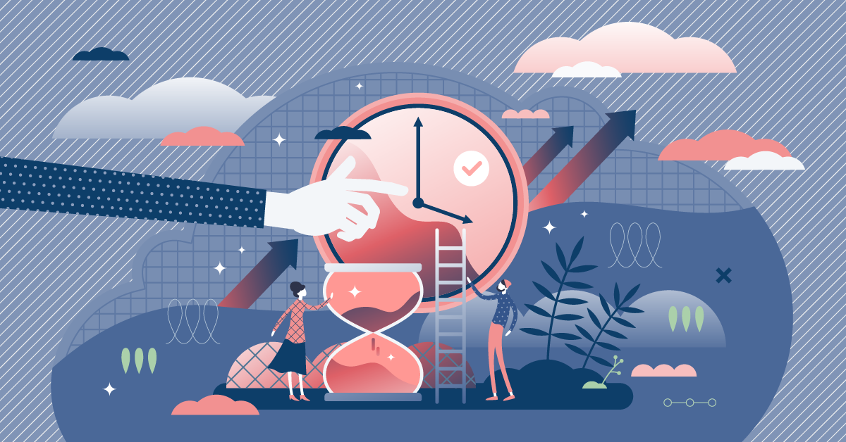
Designing for Q1 Launches: What Marketing Teams Should Be Doing Now
Q1 launches don’t start in January—they start now. If you’re a marketing team gearing up for a product launch or campaign kickoff, this is your guide to getting the design work done right (and on time). From audits to assets, here’s how to make sure your materials don’t just look good—they perform.
Q1 launches don’t happen in January. They’re built in October, November, and December—quietly, behind the scenes, while everyone else is wrapping up the year.
If you're in marketing, now’s the moment to get your design game in order before the new year chaos hits. Whether you're rolling out a new product, a refreshed campaign, or a full-blown rebrand, strong design isn't just decoration—it’s how your message gets delivered (and remembered).
Here’s how to get ahead of the Q1 rush—with design that actually works.
1. Audit What You’ve Got
Start with a reality check. Are your current materials still doing the job—or just…there?
Review your:
Sales decks
Ebooks and white papers
Case studies and one-pagers
Event or tradeshow graphics
Social templates
You’re looking for signs of brand drift, outdated messaging, and assets that feel more “meh” than magnetic. This is where a graphic designer for brands can offer fresh eyes and a clear plan for leveling up.
2. Loop In Design Early (Trust Me)
Waiting to bring in a designer until “everything else is final” is like decorating a cake after it’s been sliced.
Design isn't just about execution—it's part of the strategy. When I'm pulled in early, I help teams:
Choose the right formats for their goals
Streamline messy content into clean layouts
Flag potential production hiccups before they happen
As a corporate design expert, I’m here to help you launch smarter—not just prettier.
3. Create to Persuade, Not Just Announce
Q1 is prime time for product rollouts and big ideas. But attention is scarce—and bland visuals won’t cut it.
To stand out, you need assets that inform and inspire:
A crisp, conversion-focused sales deck
A design-driven ebook that doesn't just sit in a folder
A scroll-stopping infographic that makes your message stick
Design matters here—not because it’s flashy, but because it’s functional. It turns information into impact.
4. Think Beyond Launch Day
Once your campaign is live, you’ll need variants, updates, and localizations. A strong design system—and a designer who gets your brand—makes that way less painful.
That’s where production design for marketing teams comes in. It’s not just about building assets; it’s about building a system that scales.
Let’s Make January Feel a Little Less…January
If you want Q1 to start strong, the time to prep is now.
Need a design partner who speaks strategy, meets deadlines, and makes your team look good?
Let’s talk. I’m currently booking for end-of-year design work and Q1 campaigns.

More Than a Logo: What Designers Really Do for Brands
A logo is just the beginning. A graphic designer for brands builds the entire visual framework that shapes how your audience sees—and remembers—you. From typography to color to layouts, every design choice should support your strategy. Otherwise? It’s just filler design.
When most people hear “graphic designer,” they think logos, fonts, maybe a color palette. But if that’s all you’re getting, you’re missing out. Branding isn’t just about visuals—it’s about meaning. A true graphic designer for brands doesn’t just decorate; they build the visual framework that carries your message, shapes perception, and reinforces what your business stands for. Every line, color, and layout decision should support your strategy. Otherwise, it's just noise.
The Problem: Pretty but Pointless Design
Too many brands settle for design that looks good on the surface but falls flat in context. You’ve seen it—slick visuals with no staying power, or worse, ones that actively confuse the message. Without a clear strategy behind the work, design becomes a collection of disconnected pieces: a brochure that doesn’t match the website, a pitch deck that feels off-brand, a social feed that lacks cohesion. The result? Inconsistency, confusion, and a brand that feels more like a placeholder than a presence.
The Approach: Strategy First, Style Second
My approach always starts with intent. Before I open any design software, I ask the bigger questions: What are you trying to say? Who are you speaking to? What behavior are you trying to drive? Once we understand those core truths, then we build the visual language to match.

Typography choices communicate tone. Color schemes create mood. Layout and hierarchy guide the eye—and ultimately, the action. A brand’s visual identity should work like a well-engineered structure: every element has a purpose, and every choice supports the whole. Whether we’re designing a sales deck, an email header, or a tradeshow booth, the visuals should reinforce your message—not distract from it.
The Result: A Brand That Shows Up and Stands Out
When design is rooted in strategy, your brand becomes more than recognizable—it becomes memorable. Every touchpoint starts to feel like it’s part of a larger, intentional ecosystem. That kind of consistency builds trust with your audience and gives your internal teams the clarity they need to stay on-message.
Clients have said things like:
“This is the first time our brand actually feels like us.”
“Our marketing team is faster and more consistent now"”
That’s the power of design done right. It’s not just about making things look nice. It’s about making every visual decision count—because when form follows function, brands flourish.
TL;DR? I Don’t Just Make Things Pretty. I Make Them Make Sense.
Looking for a graphic designer who can connect the dots between strategy and style? Let’s Talk.
Why User Experience Matters More Than Visuals.
Good design is obvious. Great design is transparent.
It’s easy to fall into the trap of thinking design is only about how something looks. A slick website, a flashy sales deck, or a bold trade show booth might turn heads at first glance—but if people don’t know what to do once they see it, the design has failed. Worse yet, if a design looks appealing but isn’t accessible, you’ve not only lost potential customers, you may also be out of compliance with ADA design guidelines.
Great design is more than decoration. It’s about creating an experience that guides people, builds trust, and makes it effortless for them to engage with your brand. User experience (UX) is where the real magic happens.
Looks Alone Won’t Keep People Around
Imagine landing on a beautifully designed website with vibrant colors and sharp typography. At first, you’re impressed. But then you start looking for what you came for—a demo request form, product details, or a simple way to contact someone—and you can’t find it. Within seconds, that initial excitement turns into frustration. Most people won’t stick around.
The same applies to marketing collateral. A visually dazzling sales deck that overwhelms the audience with too much text or cluttered graphics leaves them confused. An event booth that looks incredible but doesn’t invite people to engage misses the point.
Good design solves this problem by balancing form and function. Visual appeal gets people in the door, but usability is what makes them stay.
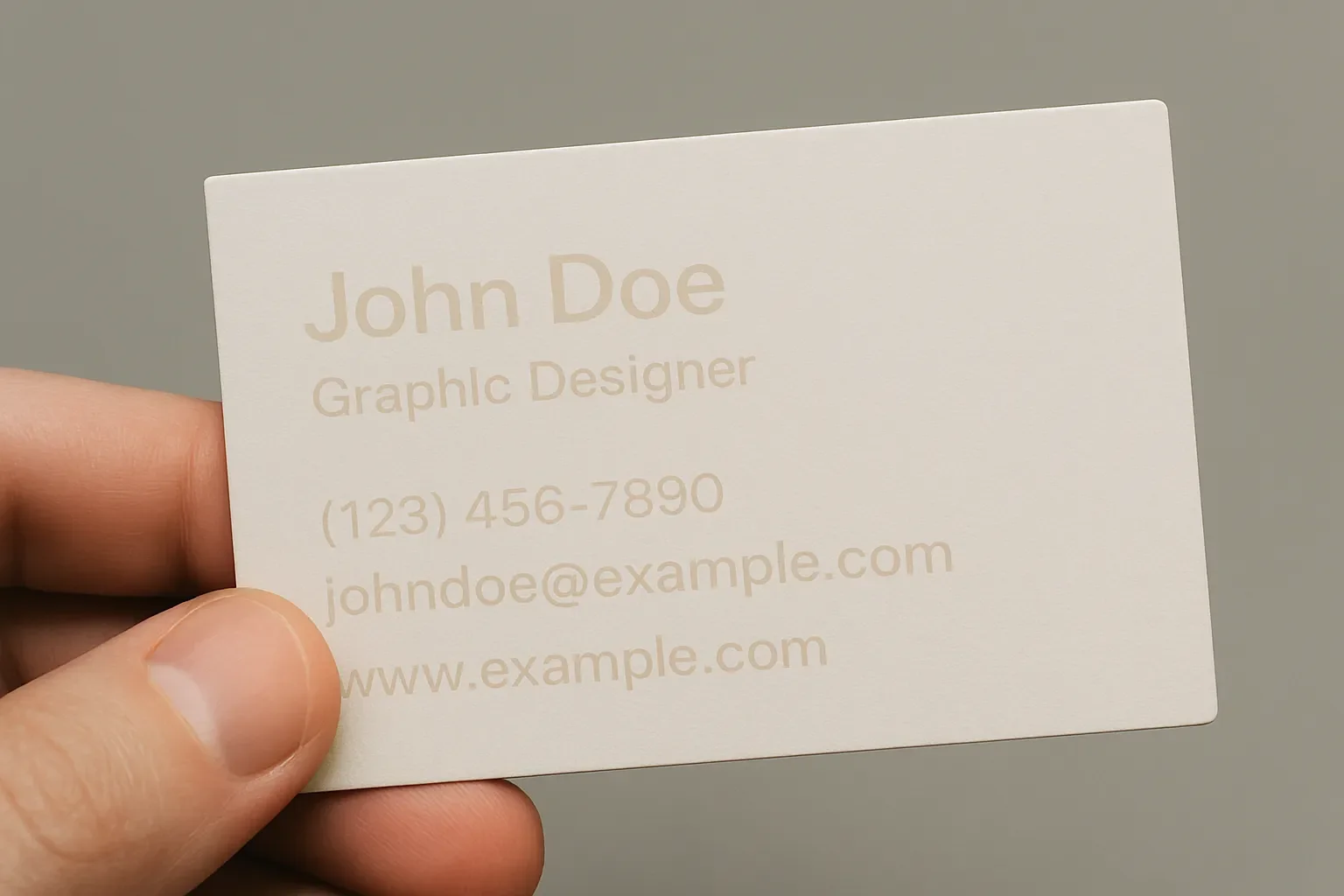
This business card looks stylish, but the low contrast makes the text nearly impossible to read. Design without legibility leaves users frustrated and misses the message.
Accessibility Is Part of the Experience
User experience isn’t just about convenience—it’s also about inclusivity. If your design doesn’t meet ADA accessibility standards, you risk alienating part of your audience.
Accessibility goes beyond compliance checkboxes. It’s about making sure everyone, regardless of ability, can navigate and benefit from your brand’s message. That means:
Readable text: Strong contrast between text and background.
Clear navigation: Easy-to-use menus and links that work with screen readers.
Alt text: Descriptive text for images so the story is accessible to everyone.
Keyboard functionality: Ensuring people who don’t use a mouse can still interact with content.
When accessibility is baked into the design process, you’re not just avoiding lawsuits—you’re expanding your reach and building equity into your brand. Accessibility is good ethics, but it’s also good business.
How UX Shapes Business Outcomes
At JW Player (now JWP Connatix), we faced this challenge head-on during a major website redesign. The old site looked fine, but users weren’t finding what they needed quickly. That meant fewer conversions and lost opportunities.
The solution wasn’t just a new color palette or typography system—it was rethinking the flow. We worked with the demand gen team to design clear pathways for users, guiding them from curiosity to action with fewer clicks and clearer messaging. Every decision was tested with one simple question: “Will this help the user take the next step?”
The results were clear: better engagement, more conversions, and a stronger brand presence. The polished visuals mattered, but they only worked because the experience made sense.

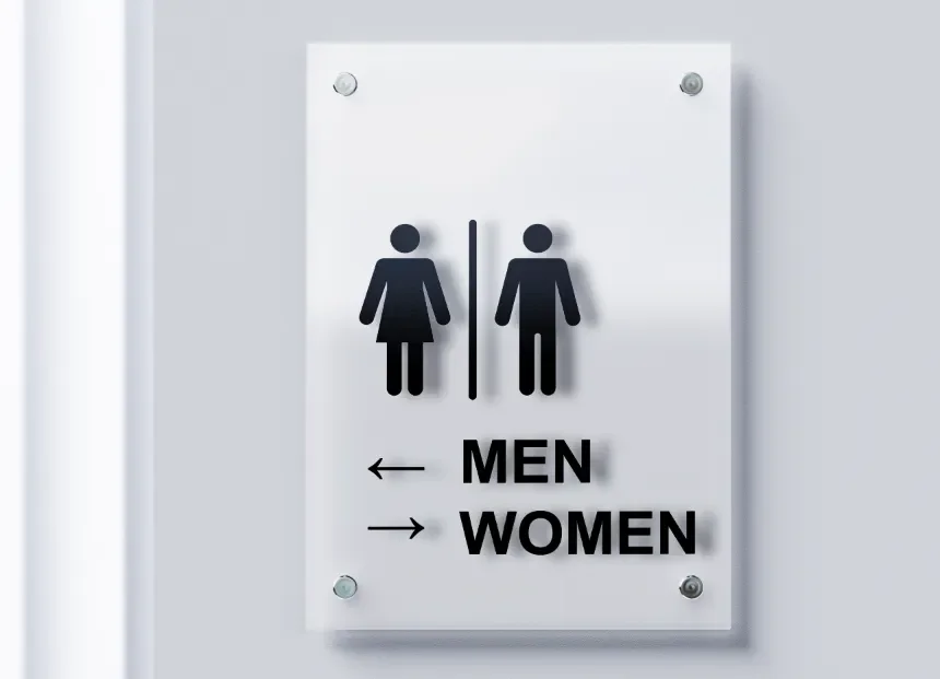
This restroom sign tries to be helpful but ends up confusing. The icons for men and women are clear, but the arrows underneath point in opposite directions—making people stop and second-guess where they’re supposed to go. It’s a good reminder that clarity matters more than cleverness in design.
Style Still Has Its Place
Focusing on user experience doesn’t mean ignoring style. In fact, style is what makes a functional design memorable. The key is making sure style supports, rather than overshadows, usability.
Think of style as the emotional layer of design. It sets the tone, creates recognition, and connects on a human level. But style can’t come at the expense of clarity. The sharp angle of a font, the boldness of a color scheme, or the energy of an image must all work in service of the user’s journey.
When done well, style and usability reinforce each other. A clear, accessible design infused with the right visual flair feels effortless and inviting.
Lessons From Real Projects
Over the years, I’ve seen how prioritizing user experience changes the outcome of projects:
Hunky Dory Records needed to stand out without losing their approachable vibe. The solution wasn’t just bold visuals—it was making the shopping experience intuitive, so customers could quickly browse and connect with the store’s culture.
Pinetop Distillery wanted to feel credible in the crowded craft spirits market. Clean, accessible design choices didn’t just elevate their brand visually; they also made it easier for distributors and customers to engage with them.
JW Player / JWP Connatix achieved stronger conversions when design decisions focused on user flow and clarity rather than surface-level visuals.
In each case, user experience was the foundation. Style gave the projects personality, but usability made them successful.
A User-First Design Checklist
Here are a few principles I use when approaching any project:
Clarity over complexity: Can users immediately understand what to do?
Hierarchy matters: Are the most important messages front and center?
Accessibility first: Does the design meet ADA standards for contrast, navigation, and alt text?
Consistency builds trust: Does the experience look and feel unified across touchpoints?
Responsive design: Does it work just as well on a phone as it does on a desktop?
When these principles are in place, design does more than look good—it works.
Why This Matters to Clients
At the end of the day, design isn’t about impressing other designers. It’s about solving problems for clients and their audiences. A website that looks incredible but frustrates visitors is a wasted investment. A sales deck that dazzles but confuses leaves opportunities on the table.
User experience ensures your design decisions have impact. It’s the bridge between style and strategy, the piece that turns visual appeal into meaningful results.
That’s why I believe design is problem-solving with style—and why user experience is always at the center of the solution.
Want to create a design system that looks great and works for your audience? Let’s talk.

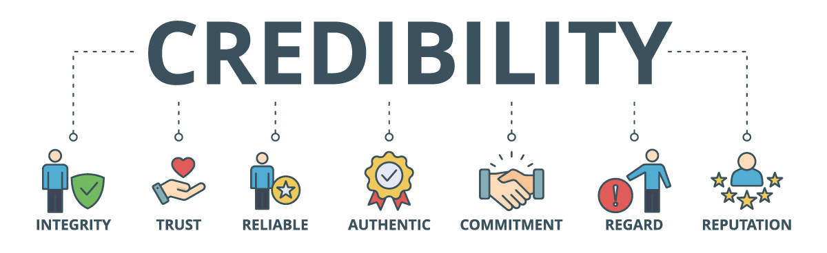
Why Brand Consistency Matters More Than Ever
In a world where attention spans are shorter than a TikTok loop and competition is only a click away, your brand doesn’t get many chances to make an impression. The reality is simple: if your audience sees mixed messages, mismatched visuals, or inconsistent tone, trust evaporates. And without trust, conversions don’t follow.
Consistency in branding isn’t just about looking polished—it’s about building recognition, reliability, and credibility. When every touchpoint speaks the same visual and verbal language, your audience knows what to expect. That sense of familiarity makes them far more likely to engage, buy, or advocate for your brand.
As someone who has helped companies large and small establish and refine their brand systems, I’ve seen firsthand how consistency drives both trust and results. Let’s break down why it matters, and what you can do about it.
The Psychology of Consistency
Human brains are wired for patterns. When we encounter familiar cues—colors, logos, tone of voice—we process them faster and with less effort. This “cognitive ease” builds a sense of comfort and reliability.
Think about your favorite coffee shop. If their logo was teal on the website, red on social media, and yellow on the storefront, you’d probably wonder if you were in the right place. The same principle applies online. A consistent brand signals stability and professionalism, while an inconsistent one raises red flags.
In short: consistency breeds trust, and trust unlocks conversions.
What Inconsistent Branding Really Costs You
Many businesses underestimate the hidden cost of an inconsistent brand. Here are a few of the biggest pitfalls:
Lost recognition: If your logo, typefaces, or color palette shift depending on the platform, your audience won’t remember you.
Confused messaging: If your tone veers from playful in an email to overly stiff on LinkedIn, it undermines credibility.
Inefficient workflows: Without guidelines, teams waste time recreating assets, debating style choices, or correcting mistakes.
Weaker conversions: If trust breaks down, so does the path from awareness to purchase.
I’ve worked with marketing teams where every deck and sales sheet looked like it came from a different company. After implementing brand guidelines and templates, not only did the materials look more professional, but sales teams closed deals faster because they could focus on the message instead of the mess.
Real-World Proof
During my time leading design at JWP (formerly JW Player), consistency was a non-negotiable. We were speaking to a global audience in a crowded B2B tech market. Every campaign, website update, sales deck, and event booth needed to feel like one voice—even if different teams were producing the work.
The result? A recognizable, trustworthy presence that helped us stand out in a competitive landscape. Marketing could confidently push campaigns knowing design backed them up, and sales had materials that looked sharp and aligned with the story they were telling.
Smaller businesses see the same benefits. For Pinetop Distillery, consistency across packaging, website, and event collateral helped them punch above their weight in a crowded spirits market. When a brand looks unified, it feels bigger, more established, and worth trusting.
How Consistency Boosts Conversions
Consistency doesn’t just look good—it drives results:
Recognition → Recall → Action
Repeated exposure to consistent brand elements builds recognition. Recognition leads to recall (“I know this brand”), and recall drives action (“I’ll choose them over someone new”).Trust Shortens the Sales Cycle
A cohesive brand creates confidence. Prospects feel safer moving forward with a company that “has its act together.”Seamless Experiences Increase Retention
Customers stick around when the journey feels predictable and reliable across all channels.
A study by Lucidpress even found that consistent branding can increase revenue by up to 23%. That’s not just design—it’s dollars.
Building Brand Consistency: A Practical Framework
So, how do you ensure your brand feels like one voice across every channel? Here are a few steps I use with clients:
Create Brand Guidelines
Define your logo usage, color palette, typography, photography style, and voice. Keep it practical, not just pretty.Use Templates
For sales decks, one-pagers, social posts, and internal docs. This speeds up production and ensures alignment.Centralize Assets
Store logos, icons, imagery, and approved templates in one accessible place. No more hunting down the “latest version.”Train Your Team
A style guide is useless if no one reads it. Walk teams through the why behind the guidelines so they buy in.Audit Regularly
Every few months, review marketing and sales touchpoints. Look for misaligned visuals or outdated messaging that need cleanup.
Beyond Design: Tone and Experience
Consistency isn’t only visual. It extends to how you sound and how you show up:
Tone of voice: Is your messaging approachable, technical, witty, or professional? It should be consistent across web copy, emails, and presentations.
Customer experience: From the way your support team answers emails to how your event booth feels, every interaction should reflect the same brand personality.
When visuals, words, and experiences align, your brand becomes magnetic.
Final Thoughts
In today’s crowded market, brand consistency isn’t optional—it’s essential. It builds trust, shortens sales cycles, and fuels growth. Whether you’re a startup trying to look bigger than you are or an enterprise managing multiple teams, the payoff of consistency is undeniable.
As a graphic designer and creative director, I see my role as more than just making things look good. It’s about creating clarity and building systems that help brands show up with confidence.
If your brand feels fragmented, it’s not too late to bring it together. Start small—clean up your decks, align your social presence, or create a simple style guide. Each step you take strengthens trust and paves the way for conversions.
Want to bring clarity and consistency to your brand? Let’s talk.
Why Cold Emails Feel Cold (And How to Warm Them Up)
Cold emails often fail because they feel generic and detached. The fix is simple: find one specific thing about the client before you hit send. For example, noticing that a coffee shop’s website isn’t mobile-friendly can open the door to a real conversation—because you’re pointing out a problem that matters to them. Structure your email around their challenge, your solution, and the result they could expect—and always close with a clear call to action.
We’ve all been on the receiving end of a cold email that feels… well, cold. Generic greetings, vague offers, and no real understanding of who we are or what we need. They’re easy to delete because they don’t give us a reason to care.
That’s the biggest problem with cold outreach: it often skips the part where you connect with the actual human on the other end.
Find Something Specific First
If you’re reaching out to a potential client, start by doing a little homework. Look at their website, their social media, or even their physical space if it’s local. Find one tangible thing to point out that shows you’ve paid attention.
Let’s say you’re emailing a local coffee shop—Brew & Bean Co.. You notice their website isn’t mobile friendly. That’s a big deal when so many people are searching for “coffee near me” while on the go. A clunky mobile experience could mean missed foot traffic and lost sales.
Opening your email with that insight instantly changes the tone. It shows you’re not sending the same message to 200 people—you’re writing to them.
How to Structure the Email
Think of a good outreach email like a mini story with three beats:
The Problem: Briefly highlight the issue you noticed (in this case, a site that’s tough to use on mobile).
The Solution: Show how your skills or services could address it (redesigning for responsive, mobile-first browsing).
The Result: Paint a picture of the impact (more customers finding them, easier ordering, more coffee sold).
Keep it short, conversational, and focused on them—not on you.
Don’t Forget the CTA
Too many emails end with a polite “let me know.” Instead, give your reader a clear next step. For example:
“Would you be open to a quick call next week to talk about making Brew & Bean’s site easier to use on mobile?”
That’s a simple, direct ask that keeps the conversation moving forward.
The bottom line: Cold emails don’t have to feel cold. By doing your homework, structuring your message around a client’s real needs, and including a strong CTA, you can turn a cold open into a warm opportunity.
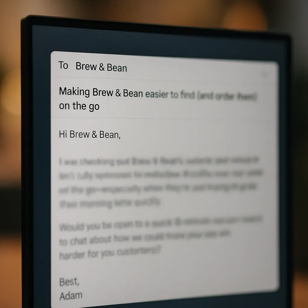
Subject: Making Brew & Bean easier to find (and order from) on the go
Hi B&B,
I was checking out Brew & Bean’s website and noticed it isn’t fully optimized for mobile. That can be tough for people searching “coffee near me” while on the go—especially when they’re just trying to grab their morning latte quickly.
I specialize in designing mobile-friendly websites that not only look great but also make it easy for customers to find what they need fast. For a neighborhood spot like Brew & Bean, that could mean more foot traffic, smoother online orders, and more regulars discovering you every day.
Would you be open to a quick 15-minute call next week to chat about how we could make your site work harder for you (and your customers)?
Best,
Adam
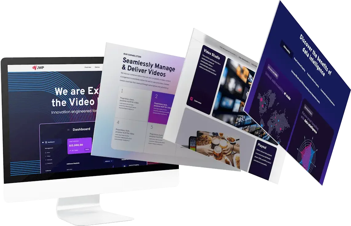
Rebuilding a legacy brand without losing the spark (JWP × Connatix)
What happens when two video powerhouses join forces, but their branding doesn’t speak the same language? That was the challenge with JWP × Connatix. As a corporate design expert, I set out to build a system that felt unified, modern, and easy for marketing teams to use. From brand consistency design to sales deck visuals and event graphics, every choice was about making the brand not just look better—but work smarter.
Some brands don’t need a facelift—they need a framework.
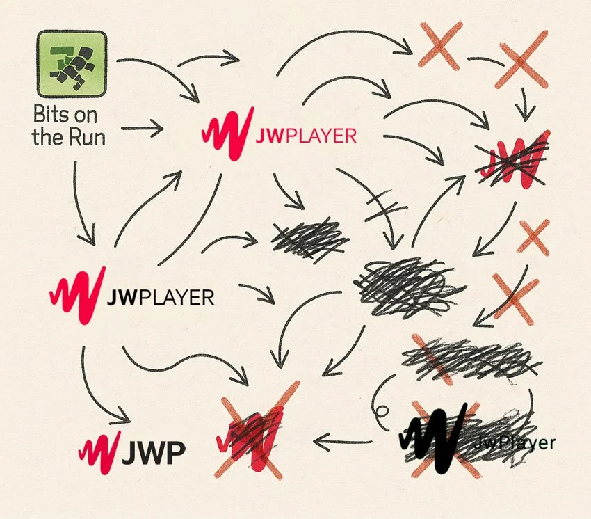
When JWP and Connatix joined forces, the visual story had drifted: great tech, scattered expression. My job was to bring clarity, cohesion, and momentum back to a name that helped build the video internet.
First move: fix the foundation (a.k.a. structure)
Before color, before type, I audited everything—product UIs, sales decks, event booths, social, even favicon behavior. The diagnosis was simple: brand drift. Marks, grids, and spacing weren’t singing from the same sheet.
What we did
Built a modular system: grids, spacing tokens, and a few repeatable patterns that scale from banner ad to trade‑show wall.
Defined brand architecture rules so “JWP,” “JW Player,” and partner badges behave consistently in lockups.
Standardized iconography and motion behaviors for product screenshots and marketing demos.
Color: energy with discipline
We kept the spirit of the original gradient but tuned it for modern accessibility and performance.
What we did
Simplified to a tight palette anchored by Rhodonite (pink), Amethyst (purple), and Cavansite (blue)—each with tints/tones that pass contrast in UI and print.
Built gradient recipes and photography overlays that feel cinematic without overpowering data or copy.
Why it matters
Video is emotion. The palette carries that energy while staying brand-consistent across dashboards, decks, and booths. (No more “mystery purple” sneaking into a keynote.)
Typography: type that does the work
We chose Overpass—a clear, geometric family that renders beautifully across platforms.
What we did
Overpass Bold for headlines (punchy, confident).
Lighter weights for product UI and dense marketing copy.
Numeric styles and tabular figures that keep analytics legible.
Why it matters
Typography is the silent PM. The right family keeps pages scannable, dashboards readable, and long-form content approachable. It also compiles faster (a quiet win for web performance).
Imagery & motion: show the story, not just the software
The brand isn’t only “the player” anymore—it’s the platform. We showed the full ecosystem.
What we did
Built UI mockups that highlight media libraries, analytics, and ad revenue at a glance.
Codified motion principles (ease, duration, direction) so animation feels purposeful, not flashy.
Extended the system to event environments, sales decks, and brand books—so the same story travels from web to real life.
Why it matters
When your product spans creation, delivery, and monetization, your visuals should too. This approach elevates the brand from “tool” to technology partner.
Naming & lockups: one voice, many contexts
Yes, there were a few logo ghosts floating around. We cleaned that up.
What we did
Established primary wordmarks and clear sub-brand rules (partnerships, product names, certifications).
Set minimum sizes and do/don’t examples to stop eye‑twitch–inducing distortions.
Why it matters
A strong mark is only as good as its governance. Consistency = instant recognition (and less production ping‑pong for marketing teams).
The result (and the ripple effects)
Brand consistency across UI, marketing, and events—without losing the original edge.
Faster production design for marketing teams: fewer questions, cleaner handoffs, reusable components.
A visual story that finally matches the product reality: intelligent, scalable, future‑ready.
You can see the full visuals, before/after, and behind‑the‑scenes thinking here:
👉 Full JWP × Connatix Project
Let’s make your brand work this hard
Whether you’re unifying teams after a merger or just tired of chasing down the “right” logo, I can help you build a system that’s purposeful and easy to use.
Want to bring clarity and consistency to your brand content? Let’s talk.