Why User Experience Matters More Than Visuals.
Good design is obvious. Great design is transparent.
It’s easy to fall into the trap of thinking design is only about how something looks. A slick website, a flashy sales deck, or a bold trade show booth might turn heads at first glance—but if people don’t know what to do once they see it, the design has failed. Worse yet, if a design looks appealing but isn’t accessible, you’ve not only lost potential customers, you may also be out of compliance with ADA design guidelines.
Great design is more than decoration. It’s about creating an experience that guides people, builds trust, and makes it effortless for them to engage with your brand. User experience (UX) is where the real magic happens.
Looks Alone Won’t Keep People Around
Imagine landing on a beautifully designed website with vibrant colors and sharp typography. At first, you’re impressed. But then you start looking for what you came for—a demo request form, product details, or a simple way to contact someone—and you can’t find it. Within seconds, that initial excitement turns into frustration. Most people won’t stick around.
The same applies to marketing collateral. A visually dazzling sales deck that overwhelms the audience with too much text or cluttered graphics leaves them confused. An event booth that looks incredible but doesn’t invite people to engage misses the point.
Good design solves this problem by balancing form and function. Visual appeal gets people in the door, but usability is what makes them stay.
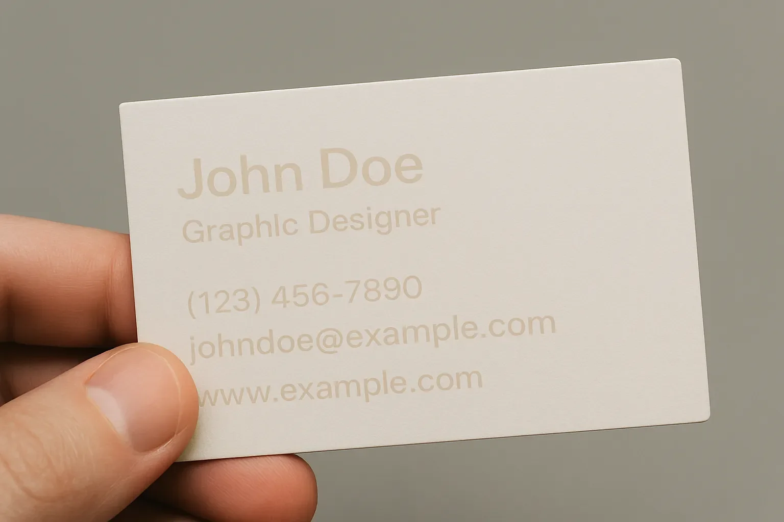
This business card looks stylish, but the low contrast makes the text nearly impossible to read. Design without legibility leaves users frustrated and misses the message.
Accessibility Is Part of the Experience
User experience isn’t just about convenience—it’s also about inclusivity. If your design doesn’t meet ADA accessibility standards, you risk alienating part of your audience.
Accessibility goes beyond compliance checkboxes. It’s about making sure everyone, regardless of ability, can navigate and benefit from your brand’s message. That means:
Readable text: Strong contrast between text and background.
Clear navigation: Easy-to-use menus and links that work with screen readers.
Alt text: Descriptive text for images so the story is accessible to everyone.
Keyboard functionality: Ensuring people who don’t use a mouse can still interact with content.
When accessibility is baked into the design process, you’re not just avoiding lawsuits—you’re expanding your reach and building equity into your brand. Accessibility is good ethics, but it’s also good business.
How UX Shapes Business Outcomes
At JW Player (now JWP Connatix), we faced this challenge head-on during a major website redesign. The old site looked fine, but users weren’t finding what they needed quickly. That meant fewer conversions and lost opportunities.
The solution wasn’t just a new color palette or typography system—it was rethinking the flow. We worked with the demand gen team to design clear pathways for users, guiding them from curiosity to action with fewer clicks and clearer messaging. Every decision was tested with one simple question: “Will this help the user take the next step?”
The results were clear: better engagement, more conversions, and a stronger brand presence. The polished visuals mattered, but they only worked because the experience made sense.
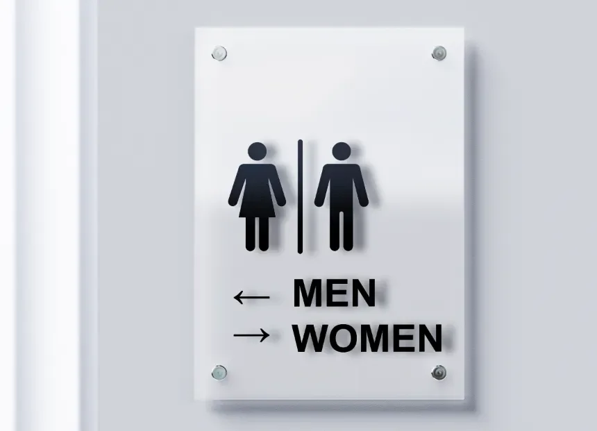
This restroom sign tries to be helpful but ends up confusing. The icons for men and women are clear, but the arrows underneath point in opposite directions—making people stop and second-guess where they’re supposed to go. It’s a good reminder that clarity matters more than cleverness in design.
Style Still Has Its Place
Focusing on user experience doesn’t mean ignoring style. In fact, style is what makes a functional design memorable. The key is making sure style supports, rather than overshadows, usability.
Think of style as the emotional layer of design. It sets the tone, creates recognition, and connects on a human level. But style can’t come at the expense of clarity. The sharp angle of a font, the boldness of a color scheme, or the energy of an image must all work in service of the user’s journey.
When done well, style and usability reinforce each other. A clear, accessible design infused with the right visual flair feels effortless and inviting.
Lessons From Real Projects
Over the years, I’ve seen how prioritizing user experience changes the outcome of projects:
Hunky Dory Records needed to stand out without losing their approachable vibe. The solution wasn’t just bold visuals—it was making the shopping experience intuitive, so customers could quickly browse and connect with the store’s culture.
Pinetop Distillery wanted to feel credible in the crowded craft spirits market. Clean, accessible design choices didn’t just elevate their brand visually; they also made it easier for distributors and customers to engage with them.
JW Player / JWP Connatix achieved stronger conversions when design decisions focused on user flow and clarity rather than surface-level visuals.
In each case, user experience was the foundation. Style gave the projects personality, but usability made them successful.
A User-First Design Checklist
Here are a few principles I use when approaching any project:
Clarity over complexity: Can users immediately understand what to do?
Hierarchy matters: Are the most important messages front and center?
Accessibility first: Does the design meet ADA standards for contrast, navigation, and alt text?
Consistency builds trust: Does the experience look and feel unified across touchpoints?
Responsive design: Does it work just as well on a phone as it does on a desktop?
When these principles are in place, design does more than look good—it works.
Why This Matters to Clients
At the end of the day, design isn’t about impressing other designers. It’s about solving problems for clients and their audiences. A website that looks incredible but frustrates visitors is a wasted investment. A sales deck that dazzles but confuses leaves opportunities on the table.
User experience ensures your design decisions have impact. It’s the bridge between style and strategy, the piece that turns visual appeal into meaningful results.
That’s why I believe design is problem-solving with style—and why user experience is always at the center of the solution.
Want to create a design system that looks great and works for your audience? Let’s talk.