
Rebuilding a Legacy.
Redefining the Future of Video.
What began as one of the most iconic brands in online video needed more than a refresh — it needed a reinvention. This was a transformation rooted in clarity, vision, and creative leadership. The result is a unified, future-ready identity that reflects the scale, intelligence, and innovation of JWP Connatix today.
What was once bold and unified became diluted and fragmented.
JW Player helped launch the online video era—powering the first YouTube upload. But after years of team changes and agency handoffs, its once-bold visual identity had splintered. Guidelines were ignored. Consistency vanished.
As Creative Director, I was brought in to fix that—reviving brand cohesion across every touchpoint and evolving the look to reflect JW’s shift from simple video player to full-stack video intelligence platform.
It Started
with Structure.
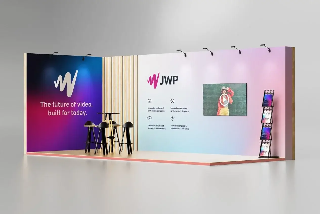
The name “JW Player” no longer fit. We’d evolved beyond a single video player into a full video intelligence platform. Dropping “Player” to become “JWP” signaled that shift—and called for a brand identity to match: sharper, unified, built to scale.
We brought it to life through launch videos that didn’t just explain the platform—they told a cohesive story. Aligned in voice, visuals, and message, these assets rolled out across the website, UI, sales decks, events, and social, making the rebrand feel real at every touchpoint.

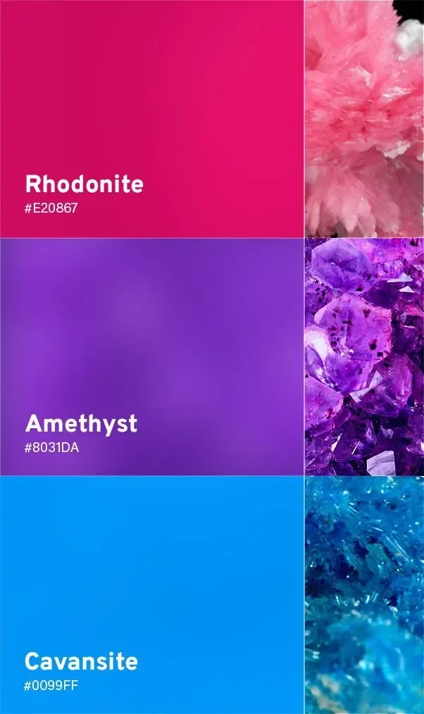
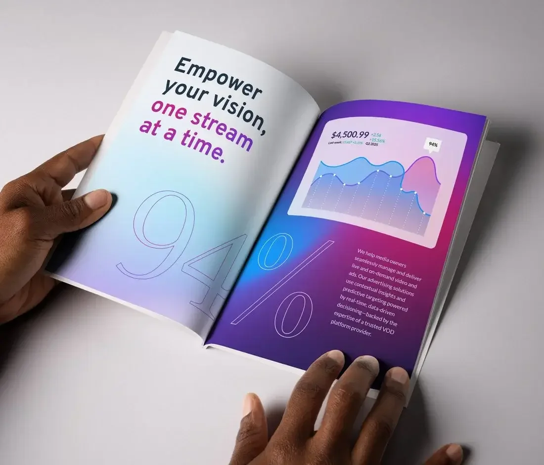
A Refreshed Palette
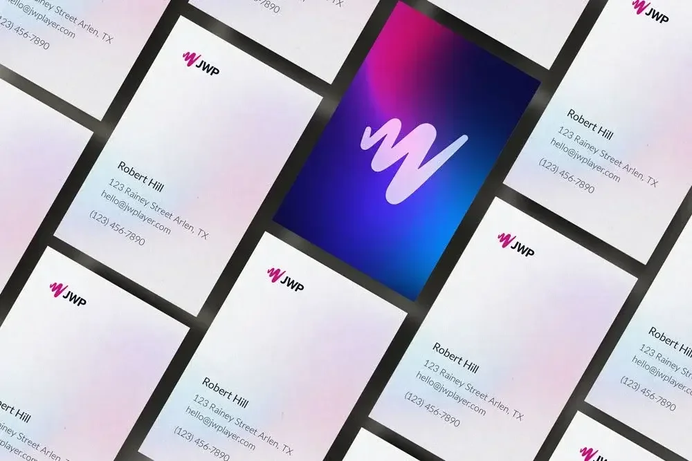
We simplified the palette for clarity and strategy. Legacy red and Connatix blue combined into a bold amethyst purple—visually symbolizing the two brands becoming one. Custom mesh gradients added energy and motion, reinforcing the story of transformation.
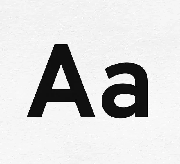
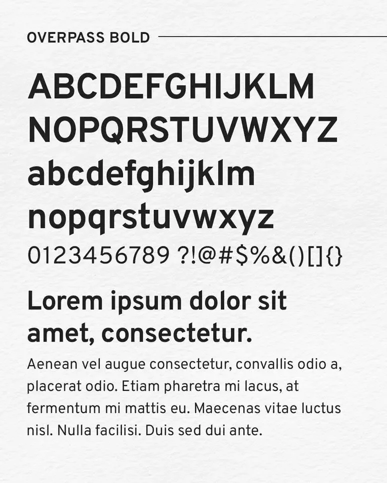
Fonts That Don’t Fight Workflow
To match the needs of a modern tech brand — and ensure company-wide adoption — we introduced Overpass, an open-source, easy-to-use Google font that integrated seamlessly into Slides, Docs, and everyday workflows across teams. Its clean geometry, high readability, and slightly industrial feel made it the perfect choice for a company grounded in data, performance, and accessibility.

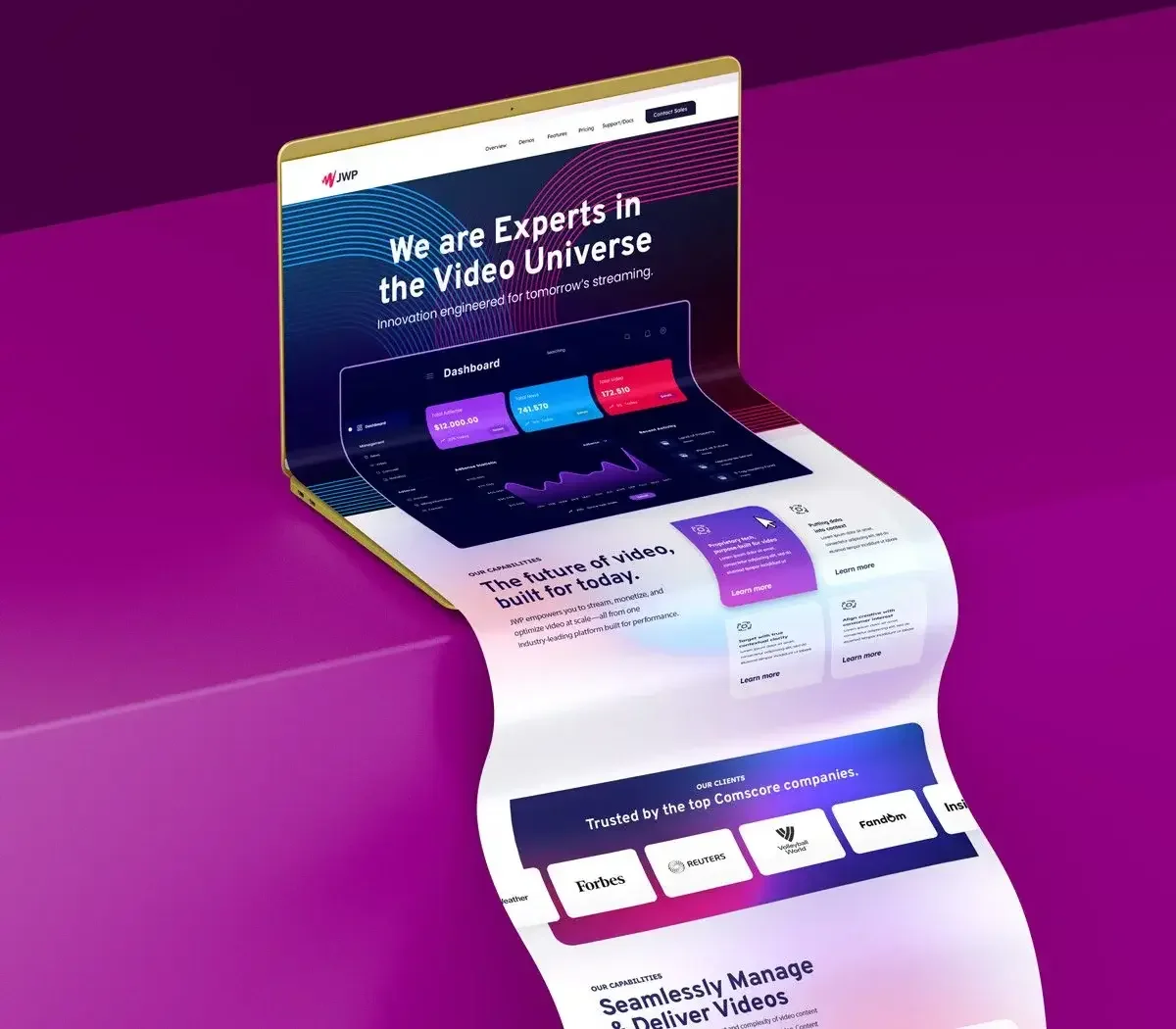
The Player Was Just the Start
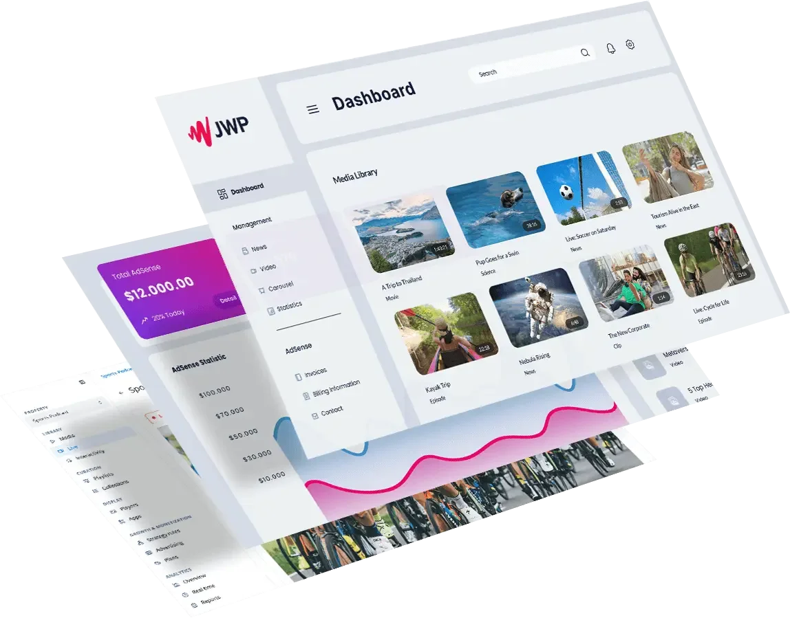
We moved beyond generic imagery of video players and stock thumbnails. Instead, we began visualizing what really made our company unique: proprietary video intelligence, publisher-focused solutions, and scalable tech infrastructure. Graphics and product visuals were reimagined to tell a fuller story — that the video player wasn’t the product, it was the gateway to our data and innovation engine.
CMO, JWP Connatix
“Super easy to work with. Always positive, open to feedback, and ready to keep pushing the work forward.”
CEO, JWP Connatix
“…Always pushing ideas further — creatively, visually, strategically. He was a perfect fit for JWPC.”
-
Absolutely. AI was a powerful tool that helped us move faster and explore broader creative directions early in the process. It’s one of the most impactful AI design use cases — accelerating ideation, visualizing brand concepts, and unlocking design territory that might otherwise go unexplored. But when it came time to craft the final identity, every detail was refined by hand. From color balance to typography to layout, it was the human touch that added the nuance, emotion, and intuition AI simply can’t replicate. The result: a brand that feels as good as it looks.
-
Not really — and that’s the point. I’m proud of where the brand is today, and how far it’s come. But like any great brand, it’s a living, breathing system — meant to grow, adapt, and evolve alongside the company. Design isn’t about locking things in forever; it’s about building a foundation strong enough to flex when the moment calls for it. So would I change anything? Not today. But ask me again in six months — and I’ll probably have a few bold ideas ready.
-
David Bowie – "Changes"(the obvious icon for reinvention)
Lizzo – "About Damn Time"(confident arrival of a new era)
The Who – "Who Are You"(a literal brand identity question)
Kendrick Lamar – “DNA.”(identity & power)
LCD Soundsystem – "Someone Great"(letting go of the old, embracing the new)
Radiohead – "Everything in Its Right Place"(things coming together)
Talking Heads – "Once in a Lifetime"(existential identity themes)
U2 – "Beautiful Day"(optimism for what’s ahead)