Rebuilding a legacy brand without losing the spark (JWP × Connatix)
Some brands don’t need a facelift—they need a framework.
When JWP and Connatix joined forces, the visual story had drifted: great tech, scattered expression. My job was to bring clarity, cohesion, and momentum back to a name that helped build the video internet.
First move: fix the foundation (a.k.a. structure)
Before color, before type, I audited everything—product UIs, sales decks, event booths, social, even favicon behavior. The diagnosis was simple: brand drift. Marks, grids, and spacing weren’t singing from the same sheet.
What we did
Built a modular system: grids, spacing tokens, and a few repeatable patterns that scale from banner ad to trade‑show wall.
Defined brand architecture rules so “JWP,” “JW Player,” and partner badges behave consistently in lockups.
Standardized iconography and motion behaviors for product screenshots and marketing demos.
Color: energy with discipline
We kept the spirit of the original gradient but tuned it for modern accessibility and performance.
What we did
Simplified to a tight palette anchored by Rhodonite (pink), Amethyst (purple), and Cavansite (blue)—each with tints/tones that pass contrast in UI and print.
Built gradient recipes and photography overlays that feel cinematic without overpowering data or copy.
Why it matters
Video is emotion. The palette carries that energy while staying brand-consistent across dashboards, decks, and booths. (No more “mystery purple” sneaking into a keynote.)
Typography: type that does the work
We chose Overpass—a clear, geometric family that renders beautifully across platforms.
What we did
Overpass Bold for headlines (punchy, confident).
Lighter weights for product UI and dense marketing copy.
Numeric styles and tabular figures that keep analytics legible.
Why it matters
Typography is the silent PM. The right family keeps pages scannable, dashboards readable, and long-form content approachable. It also compiles faster (a quiet win for web performance).
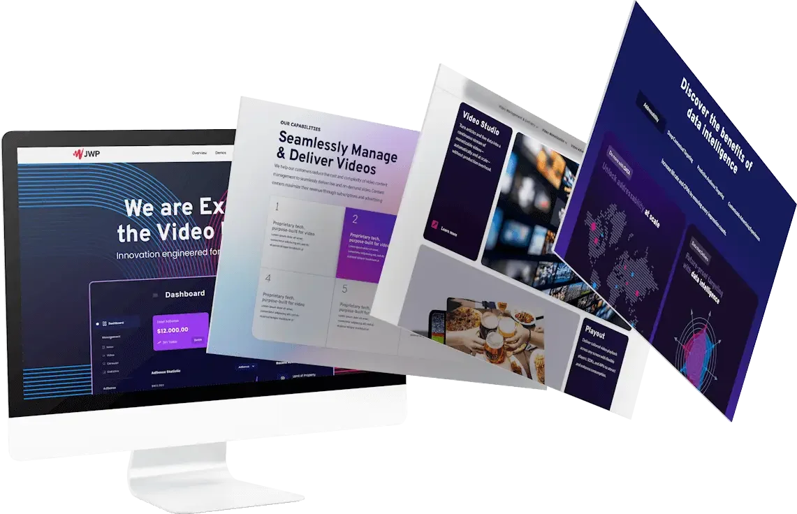
Imagery & motion: show the story, not just the software
The brand isn’t only “the player” anymore—it’s the platform. We showed the full ecosystem.
What we did
Built UI mockups that highlight media libraries, analytics, and ad revenue at a glance.
Codified motion principles (ease, duration, direction) so animation feels purposeful, not flashy.
Extended the system to event environments, sales decks, and brand books—so the same story travels from web to real life.
Why it matters
When your product spans creation, delivery, and monetization, your visuals should too. This approach elevates the brand from “tool” to technology partner.
Naming & lockups: one voice, many contexts
Yes, there were a few logo ghosts floating around. We cleaned that up.
What we did
Established primary wordmarks and clear sub-brand rules (partnerships, product names, certifications).
Set minimum sizes and do/don’t examples to stop eye‑twitch–inducing distortions.
Why it matters
A strong mark is only as good as its governance. Consistency = instant recognition (and less production ping‑pong for marketing teams).
The result (and the ripple effects)
Brand consistency across UI, marketing, and events—without losing the original edge.
Faster production design for marketing teams: fewer questions, cleaner handoffs, reusable components.
A visual story that finally matches the product reality: intelligent, scalable, future‑ready.
You can see the full visuals, before/after, and behind‑the‑scenes thinking here:
👉 Full JWP × Connatix Project
Let’s make your brand work this hard
Whether you’re unifying teams after a merger or just tired of chasing down the “right” logo, I can help you build a system that’s purposeful and easy to use.
Want to bring clarity and consistency to your brand content? Let’s talk.